A promotion is as good as it is successfully communicated to the customers. You can easily highlight and effectively promote your products with the Product Ribbons plugin.
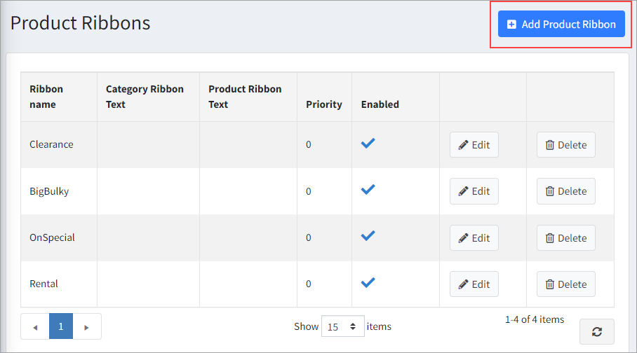
Product Ribbons allow you to add ribbons with text and images to the various products in your store.

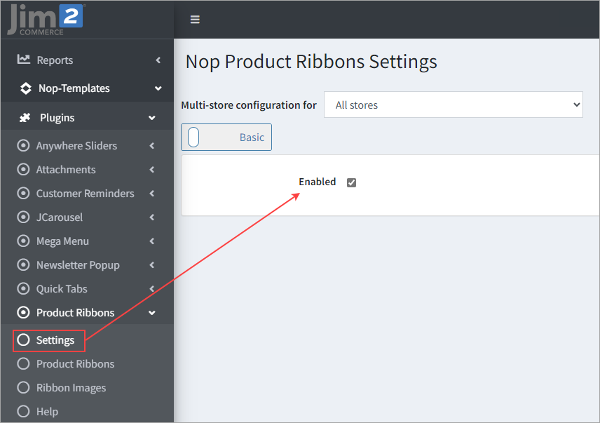
▪Enabled – If ticked, the Product Ribbons plugin will be enabled. ▪Product Box Selector – The selector for the product box. The product box is used for listing products on pages. It is used by the integration of the plugin for displaying the Small product picture ribbon. ▪Product Box Picture Container Selector – The selector for the product box picture container. The product box is used for listing products on pages. It is used by the integration of the plugin for displaying the Small product picture ribbon. ▪Product Page Picture Parent Container Selector – The selector for the parent container of the product picture located on the product page. It is used by the integration of the plugin for displaying the Big product picture ribbon. ▪Product Page Big Picture Container Selector – The selector for the container of the Big product picture located on the product page. It is used by the integration of the plugin for displaying the Big product picture ribbon. |
The General Information tab, contains general settings for the current ribbon.

▪Enabled – If ticked, this product ribbon will be activated. If unticked, the product ribbon will be deactivated. ▪Name – This is the name of the ribbon and is a required field. It is needed so you can separate your ribbons from each other, as you can have as many ribbons as you want. ▪Stop adding ribbons after this one is added – It is possible that you have several ribbons that could be shown for a given product. If this is ticked, no other ribbon will be shown after this one is shown. ▪Priority – As it is possible to have several ribbons for the same product, the priority number is used to sort the ribbons and show them in this order. The ribbon with the lowest priority number will be shown first, then the next ribbon, etc. The order is important, especially in cases when a given ribbon has Stop adding ribbons after this one added enabled as no other ribbons will be shown after it. ▪From date – Set the start date from which the ribbon will be activated. This is very useful, for example, when you want to show a ribbon for a season sale and you can set when the promotion of this sale is to start. Leave empty if you don't want to limit the ribbon by any start date and it will be activated unless you have a To date set. The From date is in UTC time. ▪To date – Setting the end date to which the ribbon will be active. This is useful when you want to stop showing the ribbon after this date. For example, when your special offer is over and the ribbon doesn't make sense any more. The To date is in UTC time. |
In the Small product picture ribbon tab, you can configure the ribbons that are show on all pages, except the one shown on the Big product image on the product page. The Big product image is separated because it is bigger than all of the other images, hence you can add a bigger ribbon to it.
 ▪Text – You can use the Available Product Tokens here. The tokens will be automatically replaced with their values for the product on which the ribbon will be shown. You could also specify the text of the ribbon. This text will appear over the product image. If you use a ribbon picture that contains text, leave this empty. ▪Enabled – You can have many product ribbons. With this setting you can choose to enable/disable the current product ribbon. ▪Position – The default location where the ribbon will appear relative to the picture of the product. You can customise further with the styles settings below, if required. ▪Picture – Manage pictures or select a picture for your ribbon. ▪Manage Pictures – Upload a new picture or delete an existing one. ▪Select picture – Select an already existing picture. ▪Preview picture – Preview the selected picture. ▪Ribbon style – Specify CSS styles that will be applied only to the ribbon html element. The ribbon html element is the main html element for the ribbon that wraps the ribbon image and the ribbon text elements. ▪It has a css class name – product-ribbon. Example styles: top: -5px; left:-5px; ▪Ribbon text style – Specify CSS styles that will be applied only to the ribbon text (label) element. The ribbon text is a label html element that is nested inside the ribbon element. ▪Ribbon image style – Specify CSS styles that will be applied only to the ribbon image (img) element. The ribbon image html element is nested inside the ribbon element. |
In the Conditions tab, you can specify conditions for the current product ribbon. If the conditions are met, the product ribbon will be shown.
 |
From the Product Overrides tab, you can include or exclude products regardless of the conditions.

For example, if you add a product with the include state, the ribbon will be shown over that product, regardless of the conditions. If you add a product with the exclude state, the ribbon will not be shown over that product, regardless of the conditions. |
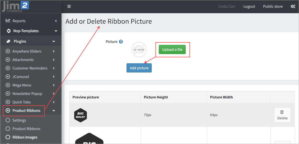
You can add a ribbon image by clicking on the Ribbon Images menu.

To add an image click on Upload a file, select your image, then click on Add picture. |
Further information
Jim2Commerce Portal Product Tags
Jim2Commerce Multiple Product Categories
Jim2Commerce Product Gender and Colour Distinctions

