|
Stock Attributes is only available for use if it is included in the Jim2 licence key. Tick Use Stock Attributes in Tools > Options > Stock > Serial/Attributes if using this feature. |
On the ribbon, go to Tools > Setups > Stock and select Stock Attributes.

From here, add, edit and delete stock attributes. When attributes are set up, they are available to use for all stock in Jim2.


There are several fields which are common to every attribute:
Field |
Purpose |
|---|---|
Description |
The name of the attribute that is being added or edited. |
Comment |
An extra description to define the attribute further. |
Type |
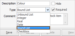
Choose what data type the attribute would fit into. If this field is set up properly, it can narrow down what users can enter as a valid attribute value. For example, only enter dates, whole numbers or choose from specific options. See Types of Stock Attributes below for further information. |
Required |
This determines whether an attribute defaults to Required on the stock card, ie. this attribute must be entered.
 |
Hide |
This determines whether the attribute will show on the invoice. |
Values
|
Enter a default value that appears in the Attribute Selection screen.

This field is optional, except for Type = Bound List. When setting this up, a list of possible values must be entered, from which users can make a choice.
 |
From |
This sets the lower value of a numeric range for Type = Integer or sets the mask pattern for Type = Real. See points 2 and 3 below. |
To |
This sets the upper value of a numeric range – only for Type = Integer. See point 2 below. |
|
There are six attribute types available: 1.Unbound List: This will create a drop down list for users to select a value, as well as being able to enter their own values if none of the existing ones are appropriate. Enter a list of suggested values, however it can be left blank.  2.Integer: This means that users need to enter a whole number attribute, ie. no decimals. In this case, Value is where a default value can be entered for the attribute as well as a range to limit the number users enter to a minimum and maximum value.  3.Real: This is for numbers that require decimal points. An optional mask can be applied from the drop down list to further validate the values entered by users. For example, a mask of #.## will only allow users to enter numbers with 2 decimal places, and -#.### will only allow users to enter a number rounded to three decimal places. The example below is one decimal place.  4.Date: Select a date as an attribute value.  5.Bound List: This will create a drop down list of values for users to choose from, however they will not be able to enter their own values if none match. These values can be changed at any time.  The order of the attribute values within the selection matrix is as per the grid order. The order can be changed by selecting a row within the grid and selecting the green up/down arrows.  6.Checkbox: this data type should be used for attributes that will have a true or false value, for example, fragile: yes/no.  |
Further information


